Activity Analysis
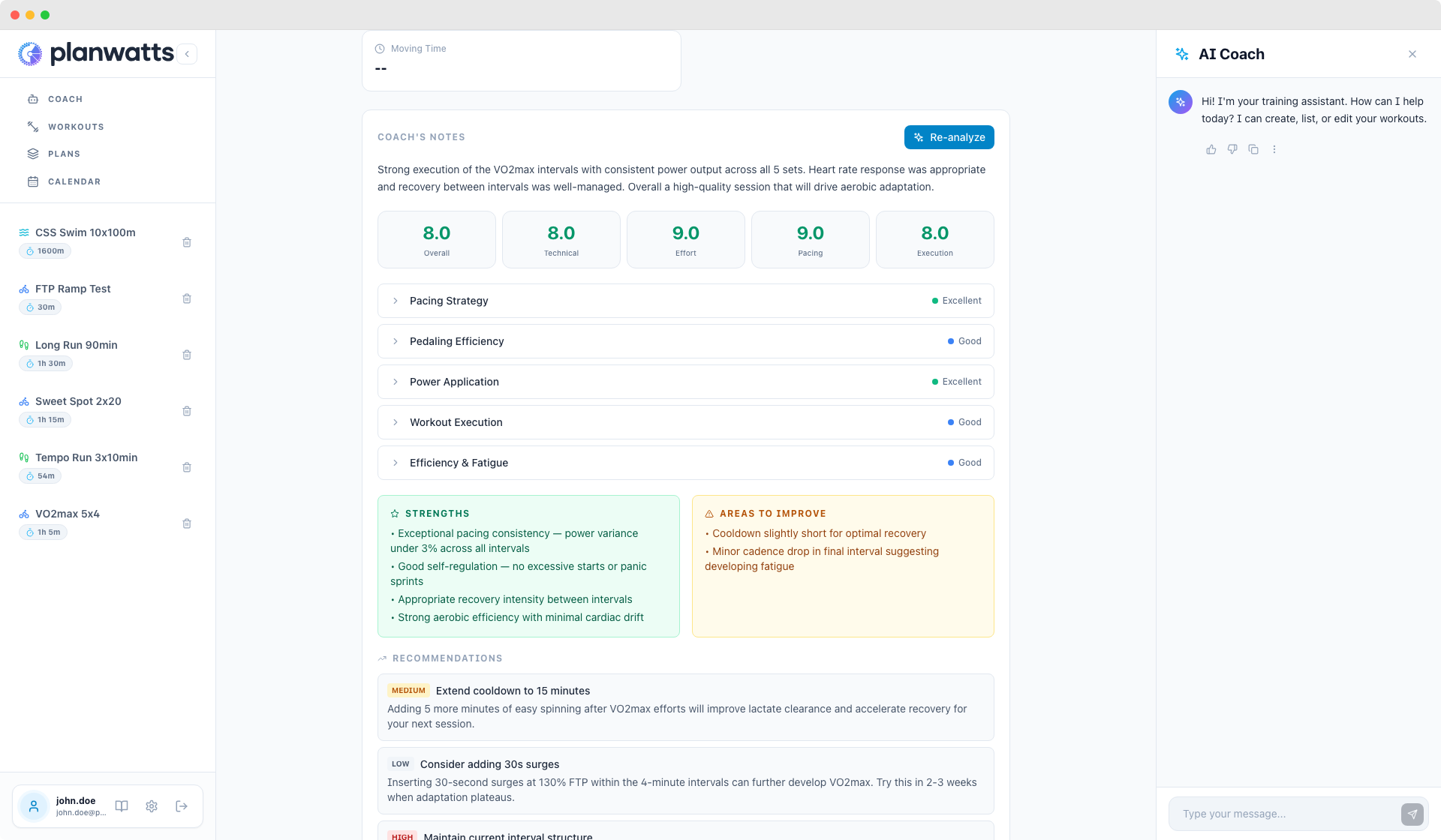
One of the things I get asked most is "I finished my ride, now what?" PlanWatts doesn't just plan your training — it reviews it too. Every completed activity gets a dedicated detail page with interactive charts, sport-specific metrics, and a structured AI analysis that tells you exactly what went well, what didn't, and what to focus on next. This guide covers how all of it works.
1. Getting to Your Activity Analysis
There are two ways to get to an activity's detail page:
From the Calendar
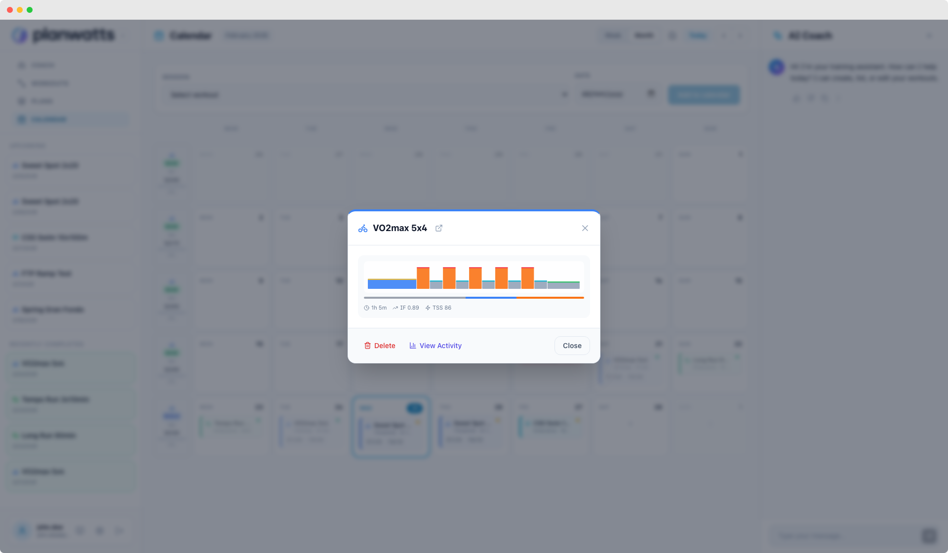
Click any completed activity on your calendar to open the event modal. You'll see a View Activity button that takes you to the full Activity Detail page (/activity/:id). If the activity was matched to a planned workout, the modal also shows a mini chart with key metrics right there, so you get a quick snapshot without leaving the calendar.
There's also an Ask Coach button on completed activities — click it and PlanWatts pre-fills a message to the Coach like "Analyze my activity 'Over-Unders 3x8' from Feb 18th. Tell me how I executed the intervals, whether I maintained target power, and give me feedback to improve." One click and the Coach starts analyzing.
From the Coach
You can also just talk to the Coach naturally:
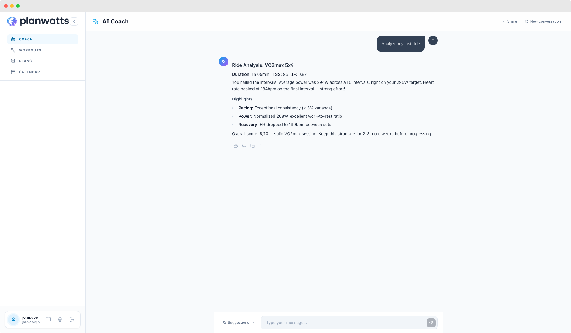
"Analyze my last ride" "How did my run on Saturday go?" "Analyze my activity from yesterday"
The Coach can find activities by date, by name, or just "the last one." It pulls the full metrics and gives you a conversational analysis right in the chat.
2. The Activity Detail Page
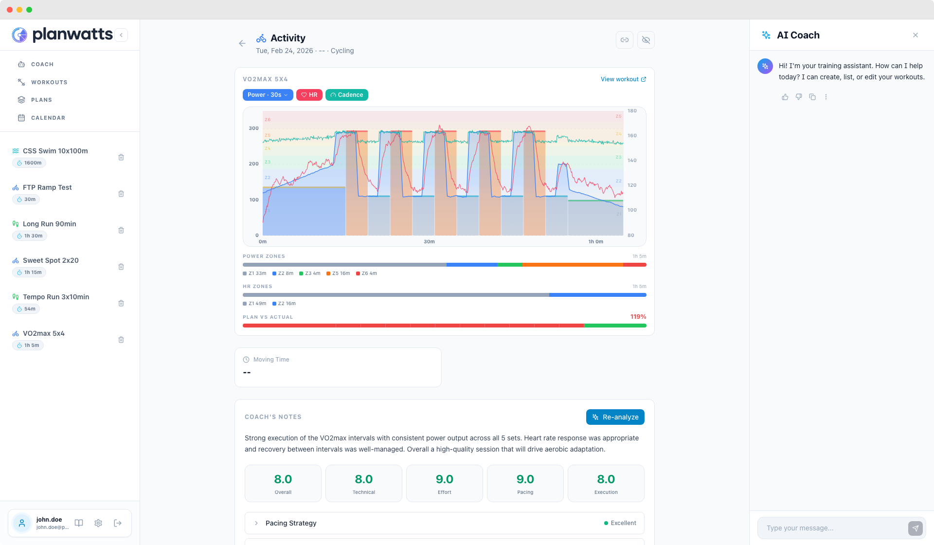
When you open an activity, you get a clean detail page with everything organized top to bottom: header, chart, metrics, AI analysis.
Header
The activity name, sport icon (color-coded per sport), date, duration, and sport type. If the activity came from Intervals.icu, Strava, or Garmin, you'll see provider badges that link back to the original activity on those platforms.
Metrics Grid
All available metrics shown as cards — only what exists for that activity. No empty placeholders.
Primary metrics (big cards): Time, Distance, TSS, IF
Sport-specific metrics (smaller cards):
- Cycling: Avg Power, Normalized Power, Max Power, Speed, Cadence (rpm), Elevation
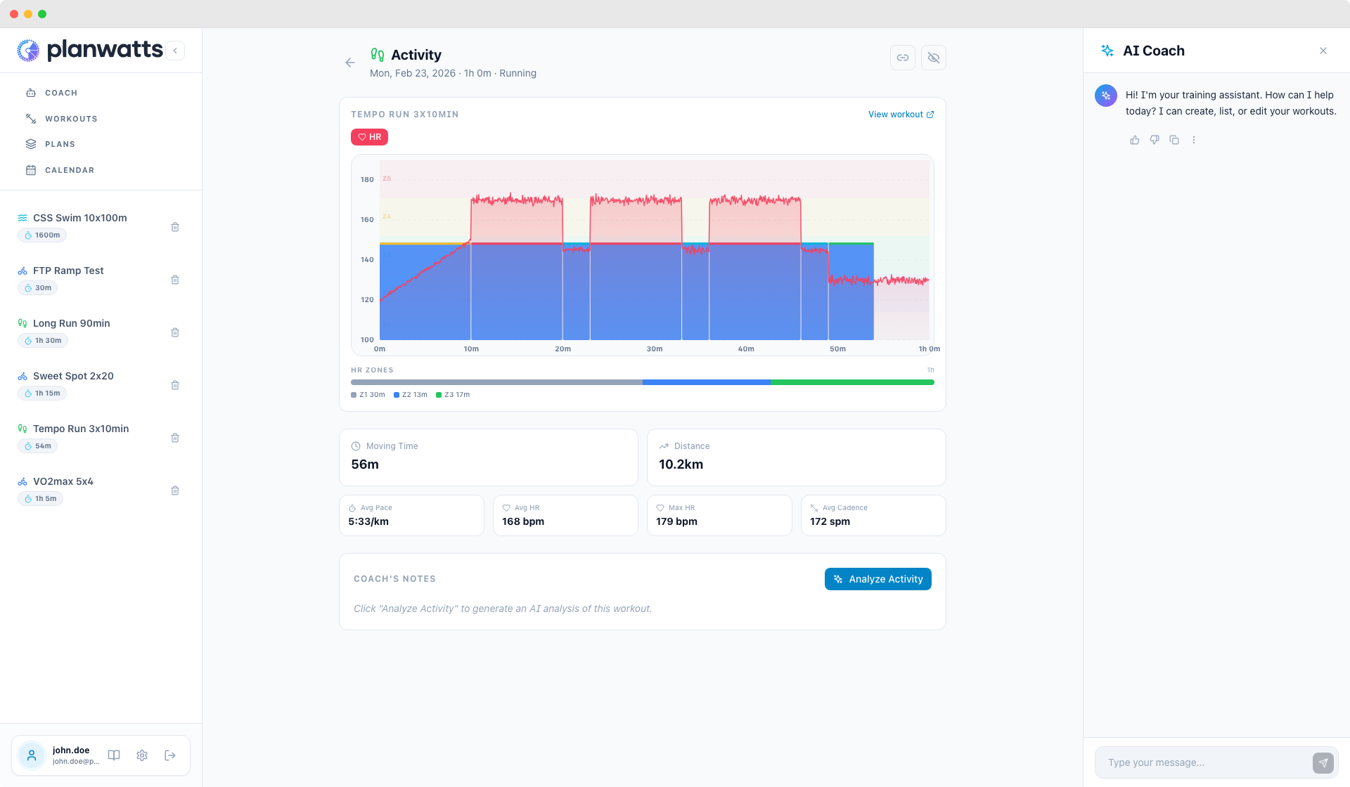
- Running: Pace (min/km), Cadence (spm), Avg/Max HR, Elevation
- Swimming: Pace (min/km), Cadence (spm), Avg/Max HR
- Strength / Yoga / Hiking: Avg/Max HR, Calories, Duration
Everything is data-driven. If your Garmin recorded cadence, you see cadence. If it didn't, that card just doesn't appear.
3. The Interactive Chart
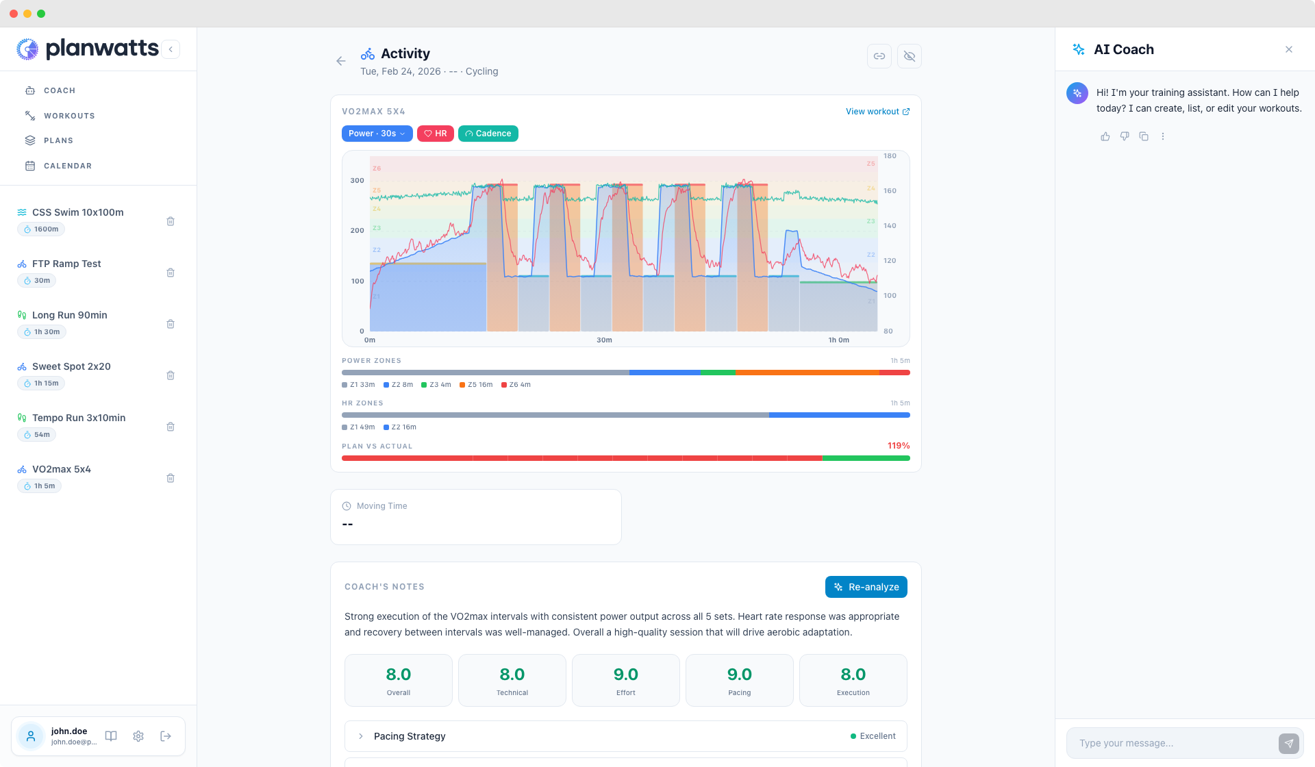
This is where it gets fun. The chart shows your real data overlaid on your planned workout.
Streams
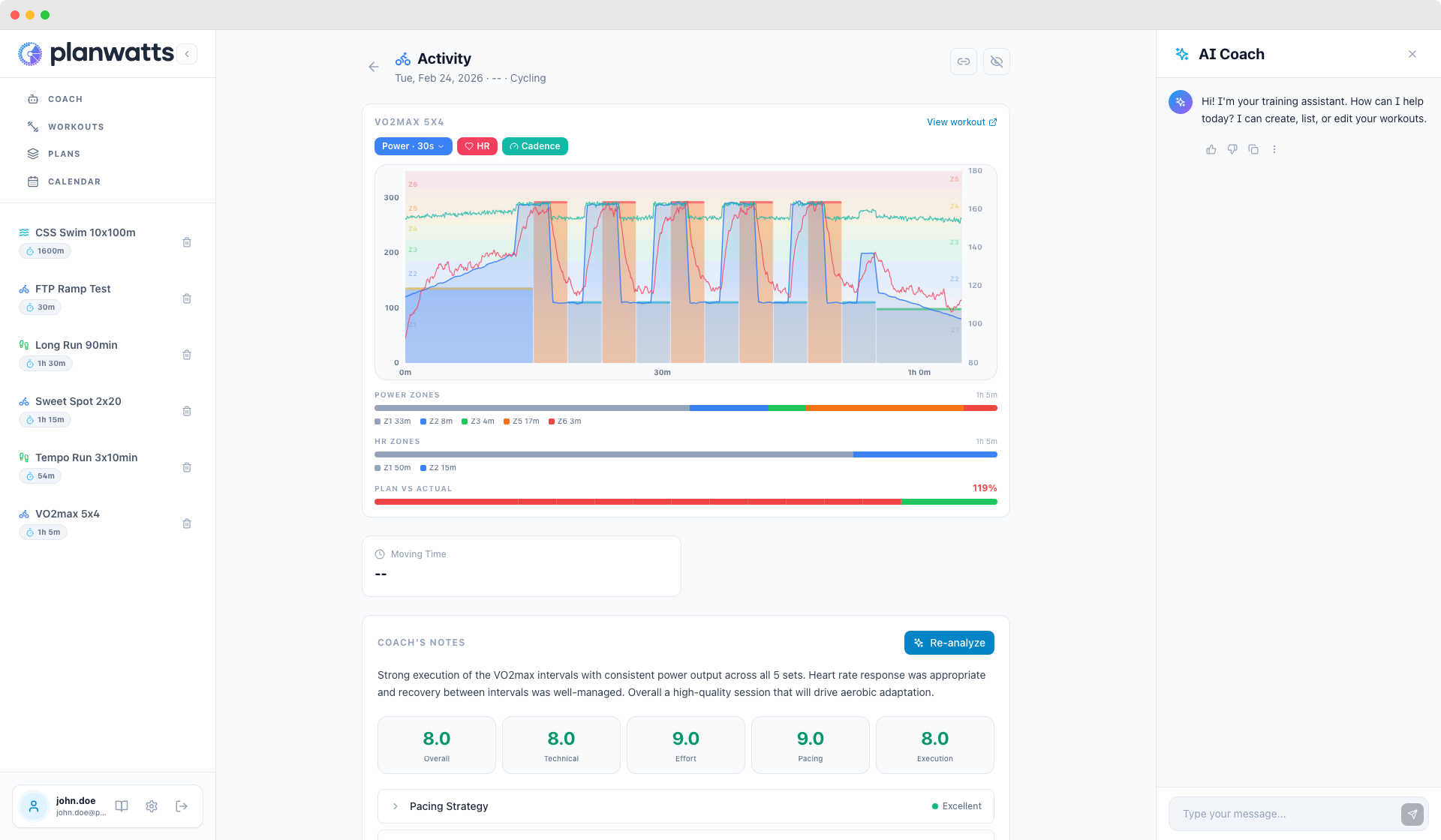
Power, heart rate, and cadence are drawn as real-time stream lines — one data point per second, downsampled to pixel resolution for performance. Hover over any point and a tooltip shows the exact values at that moment: watts, % FTP, heart rate, cadence.
Toggleable Layers
At the top of the chart, you'll see toggle pills:
- Power (blue) — always on when available, with a smoothing dropdown
- HR (red) — toggle on/off
- Cadence (teal) — toggle on/off
Click any pill to show or hide that stream.
Power Smoothing
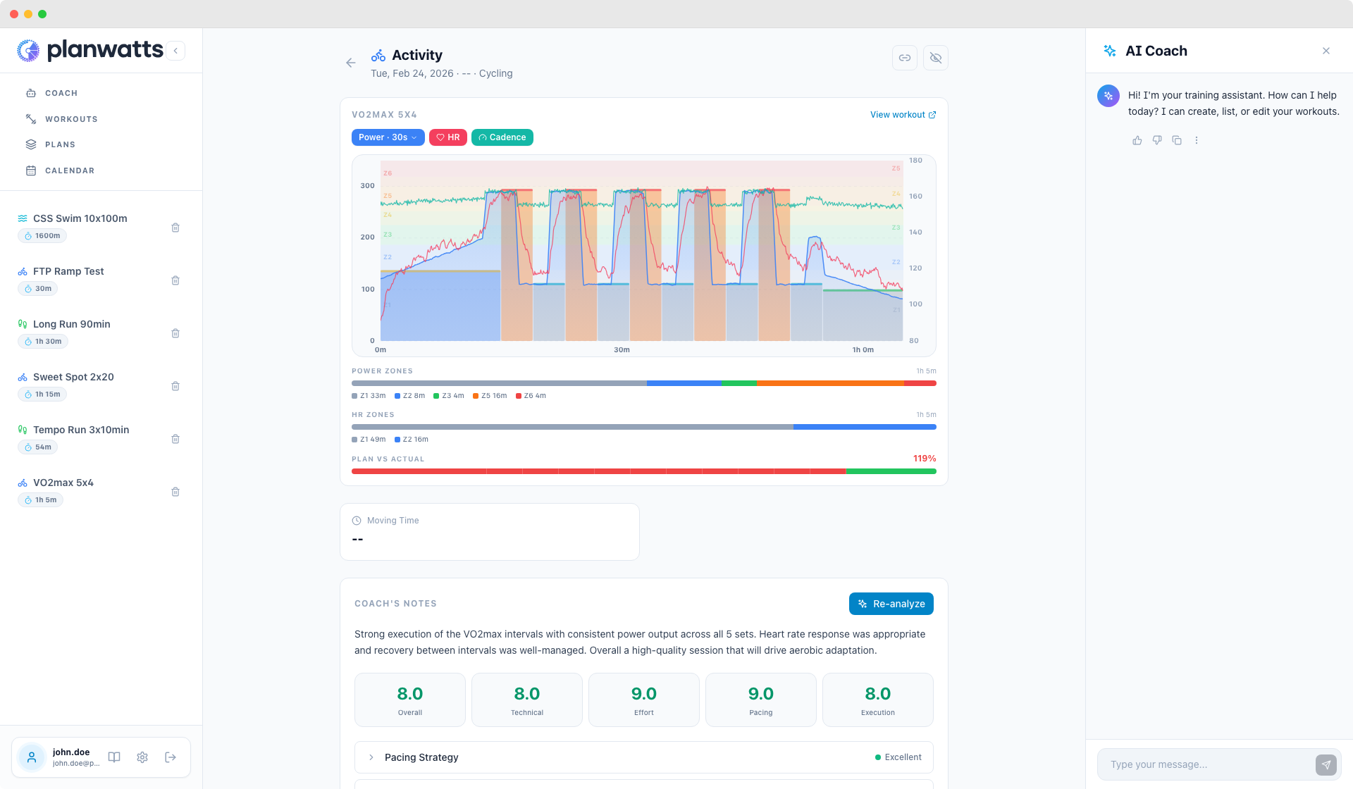
The Power pill has a dropdown: 1s / 5s / 30s rolling average. Raw 1-second data is spiky and hard to read. 30-second smoothing shows the trend. I default to 30s but switch to 5s when I want to check specific interval execution.
Planned Workout Overlay
If the activity has a matched PlanWatts workout (or an Intervals.icu workout), the planned steps appear as colored bars behind the stream lines. Each bar represents an interval step, colored by zone. The step type is indicated by a colored line at the top.
This makes it immediately obvious: did you hit the target power for each interval?
Activities Without Power
For sports without power data — strength, yoga, hiking, walking — the chart switches to HR-primary mode. Heart rate becomes the main metric on the left axis, with HR zone bands in the background.
Zone Distribution Bars
Below the chart, horizontal bars show how much time you spent in each power zone and HR zone:
- Power Zones — Z1 through Z6+, each segment colored and labeled with time
- HR Zones — Z1 through Z5, same treatment
These appear only when the relevant data exists.
Plan vs Actual Adherence
When a planned workout was matched, you get an adherence bar at the bottom. Each planned step is a segment, colored green (95-105%), yellow (90-110%), or red (outside). A weighted adherence score appears on the right — e.g., 97%.
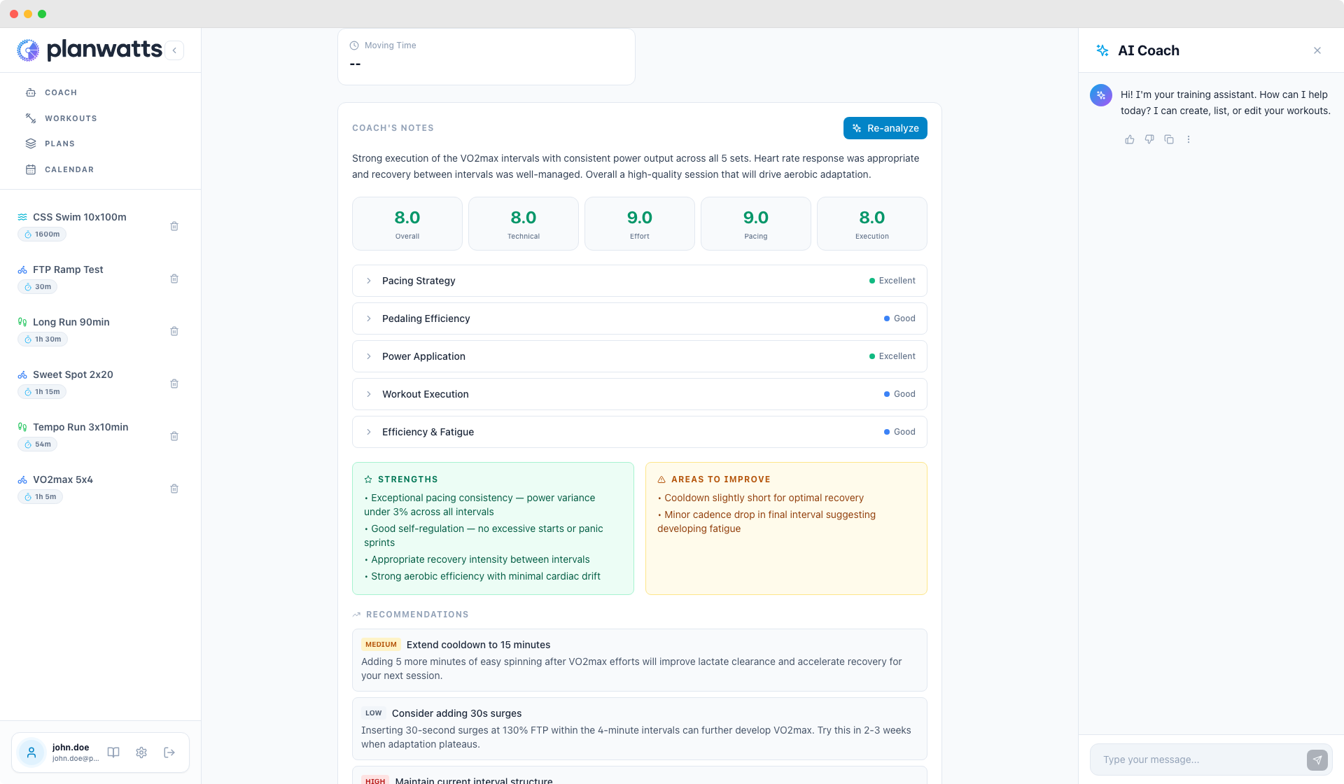
4. Route Map
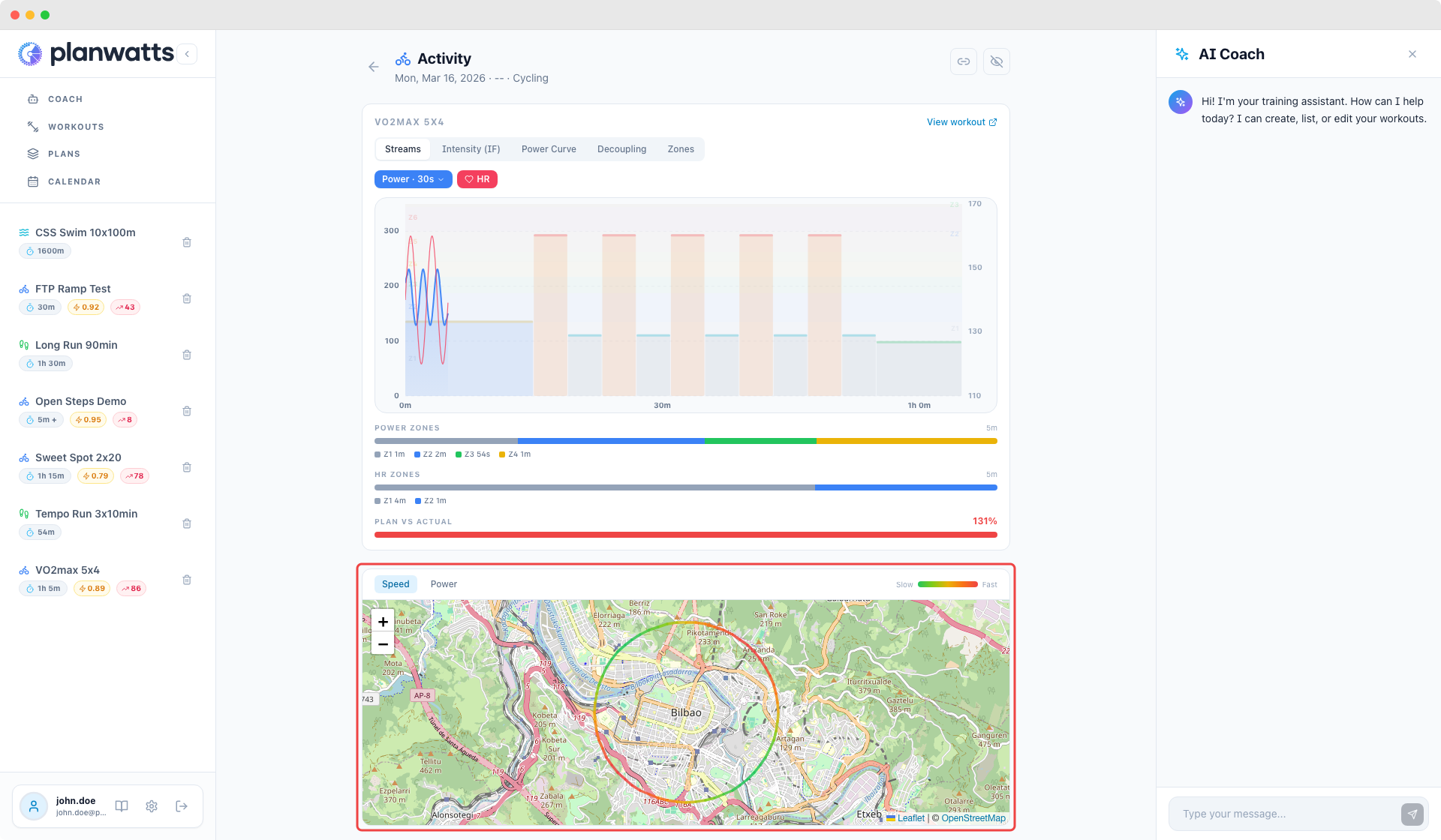
If your activity has GPS data, you'll see an interactive map below the chart showing your route on OpenStreetMap.
Speed / Power Toggle
The route is color-coded by intensity. Use the toggle to switch between:
- Speed — see where you were fastest (green) vs slowest (red)
- Power — see where you pushed hardest vs easiest (only for activities with power data)
This makes it easy to spot patterns — like always fading on the same climb or inconsistent pacing on flat sections.
Comparison Maps
When comparing two activities, both routes are overlaid on the same map:
- Activity A — blue dashed line
- Activity B — orange solid line
Click the legend to toggle each route's visibility. Great for comparing different routes or seeing how your pacing changed on the same course.
GPS data is fetched from Intervals.icu or Strava, whichever is connected.
See also: AI Analysis & Sharing